Pages

Monday 29 September 2008

Blending foam storage chest.

Hi all......been a few days since i last blogged, no decent excuse, no mishaps to blame it on....not yet anyway! Just been busy trying my hardest to keep up with everyones blogs.....a task that I'm failing miserably at!

Tonight i made a storage chest to house my foam blending pads. I love blending distress pad inks, but i do find that i get through a lot of pads and have them lying all over the place.

I saw a wonderful blending tool station where you can hang loads of blending tools with thier individual coloured pads on in a rotating rack. Thats fine if you have the money to buy all the blending tools to fill it......but to me thats just money wasted that could go on more crafty stash. I mean.....how much effort does it really take to change a foam pad!?

I saw this great little project whilst looking around a site called Crafty Storage. A talented lady called Patti Behan posted an article and a video tutorial on how to make one of these storage boxes. Well worth a look, you can find her article and video here.


I've not followed the tutorial exactly, but the basic idea is there, so a big thank you to Patti Behan for kindly sharing this idea.

I stuck brads in the front of the drawers as makeshift handles, but the back is open so you can still push the drawers out from the rear. This was a really enjoyable little project to do, something that i can easily pass on to my kids this weekend. The boxes used were ordinary matchboxes, the matches discarded first obviously. (Safetly of course.....this is Calv we are talking about!)

Plus i had Maddy to supervise me! :)

Thursday 25 September 2008

DANGER!!! Fruit inking in progress!!!

Well i have to say, that even with my history, i never expected that i would ever be involved in a mishap involving fruit!!! More on that later though........

I am posting this weeks episode of "Fruit i inked today!" from sunny Leeds. I am at my girlfriends house for the week, so she came with me to Leeds market to find this weeks subject. Lots to choose from, but two stuck out for me so this week i am treating you to not one but TWO inked fruit!

The first fruit i had a go at was not exactly the most interesting shape, very much like an apple in fact, however it was the colour that attracted me to it for inking reasons. My first fruit this week is the CHINESE PEAR!!!


The picture and computer screen does not do the colour of this fruit justice, but it was so light, it was almost white......a perfect blank canvas for inking.

I decided to do a standard dabbing and blending tachnique, and was really pleased with the result. Not the most exciting of colour effects, but i love the blended colours.

So that was the chinese pear, not a bad fruit to ink, lovely light colour to bring out the true colours of the ink, but despite looking forward to inking this fruit, i'm going to give it a fruitinkability rating of 3.

Now then, the fruit that almost became infamous for eliminating a fruit inker so early in his blossoming career! The second fruit i thought would be a great idea to ink.....and may i add was encouraged to get by Maddy, was the PRICKLY PEAR!!!


These pears apparently grow on cactus plants and usualy have long spines on them, however these ones had been removed prior to us buying them. No danger there then eh? Wrong!!!

I started inking the fruit as i usualy do, the effect was misbehaving slightly and i ended up getting the best effect from using purples and silver. However all of a sudden i started feeling pain in my hands! Thinking it was just me getting old, i carried on, however before long my fingers started to swell up, and i developed a rash like a severe netttle rash!

The pain was pretty intense and at it's worst my vision went a bit blurred and Maddy was on the verge of phoning the hospital, but luckily it only lasted a few hours. It turns out that this fruit has tiny hairlike spines also, which you pretty much cannot see.......but wow you can feel them!!!

I could'nt carry on with the second fruit, i was moaning too much with pain lol, but it was a learning curve......i learnt NOT to ink anything to do with a cactus again!!!

Maddy was an angel as usual, whilst i was in major pain, Maddy was finding out usefull things on the net like, "Ooh Calv......did you realise that they use this fruit to make the itchiest itching powder in the world?!". Really Maddy?!!! You don't say!!!!

Fruitinkability rating for this one......a 3 also, i reckon i could have achieved a 5 had i have been wearing gloves!

So not the best week for inking fruit i'm afraid. However, the next day i received a lovely gift in the post from Jennie from The Artistic Stamper.....a gift which would have saved me a lot of pain had it arrived a few hours earlier. Plastic fruit!!! Loads of it, so at some point i will possibly do a special inked plastic fruit to sign and give away as a prize here!!! Wow, ain't that something to get excited about!!! :)

Until next week......stay fruity!!!

Sunday 21 September 2008

A work in progress for my girls.

My two daughters have believed in fairies from a very early age, but thier interest took a real turn for the unexpected the day they woke up to find a tiny wooden fairy door at the top of thier stairs and fairy dust leading into thier bedroom.

What ensued is a story for another time maybe, however since then they have had countless encounters and much fun with thier tiny visitors. So i am making them a little album to put the stories of thier adventures in, so they can look back in years to come and remember.

Very much a work in progress, but i'm pleased with the cover so far....


Lots of use of distress pad blending, with some gorgeous Prima flowers dotted around. All of the stamps are Lavinia stamps, my fave is the toadstool houses. :)

I will report back in as each part of the album gets done.

Thursday 18 September 2008

Yes it's that time again folks!

Good evening my fruity friends! :)

Yes it's Thursday again, and we all know what that means, it's time for episode five of "Fruit i inked today!"

Well my little fruit bats, this week i have not only travelled afar to get my fruit, but have also risked the most dangerous parts of this country to get it too!!! I jest ye not my fruity friends, this week i travelled a monstous thirteen miles to get achieve my fruity goal. The place i got it from, is one of the roughest parts of this area,not ideal for an afternoon stroll put it this way!
However i had it on good authority that there were plenty of foreign food shops there which supplied nice fruit. So off i went.
May i just say, that i put my fruit inking mission above many other things so as not to let you down. Example: Whilst in this less than desirable place where i brought the fruit, i was approached by a lady who was obviously recognised a "business oppurtunity" with me, and shall we say that this lady probably did most of her business at night.....hmmm say no more! I politely declined the offer whilst trying hard to stop going a lighter shade of scarlet.......and carried on relentlesly on my fruit mission!
Thats dedication for you people!.......and a lesson to anyone who wants to stop me and ask "Are you busy love?" Whilst i'm trying to find fruit to ink!!! (Plus Maddy can do with embossing tools what Ninja's do with throwing stars....so it really wasn't a viable option.)
Just kidding Maddy :) xxx
SHUT UP WAFFLING CALV! i hear you say.....so heres what i inked today!!!! A bunch of dates!!!
As soon as i saw these i just knew i had to ink them! I have never seen dates like this before, the only dates i'd seen before this was the brown sticky ones you eat at xmas. This is what they looked like before they were inked......
I have to say that these were an ablsoute pleasure to ink. Even more than the melon last week. Very hard, and smooth enough to get some nice colours going on them.
Some turned out better than others, but over all i was very pleased with the result. The difference in results for each date made this all the more arty. When i added the different colours, neat from the bottle, they mixed so well anyway, but when i added mixative they just mingled and fizzed away until i got what i wanted.
Fruitinkability factor? Great! In fact, this week i'm going to give these a fruitinkablity rating of 7!!! Yes it was that good. The close-up above shows just how nice the colours turned out.
Thanks everyone, maybe next week i'll look for fruit in a more upmarket area. Much safer!

Wednesday 17 September 2008

Black Magic Challenge card.

Over at Crafts By Carolyn, there is a challenge for members to make a card, layout or whatever using a black card as a base.

So heres my attempt. It gave me a chance to use some gorgeous pen themed stamps that i've bought recently, and also the blending techniques i learnt from Dan over at A Crafty Life

I'm quite pleased with the result, especially considering i spent most of the night moaning to my girlfriend that i was rubbish at colouring and layering! Sorry Maddy, at least i did better this time round. :)


Tuesday 16 September 2008

Worry pocket.

Last week i did a fantastic pocket challenge set by Hels over at her blog, and when i saw the pocket finished, i just knew that my young daughters would be all over it!

My kids love little things. Especially little things they can hide things in. So i thought that with some minor template changes, i could create something special for my girls to use.

A big thank you to Hels for being kind enough to let me change the template for my project.
Now like most kids, another thing my girls do from time to time is worry. It may be the tiniest thing to you or I, but to them....it's a mountain on thier little shoulders. Now and again i get a little slip of paper pushed in front of me whilst i am doing something, and it will be a tiny note containing a detailed explanation of whats on thier minds.
So i decided to make them a little "worry pocket". A pocket pouch that they can hide thier worries in, and pass it to me without fear anyone else seeing it if thats what they want.

Firstly, i have a lot to learn about colour matching, and i have learnt just in this one project....lots about what not to do and what i need to improve on!
So the workings of the pocket......you undo the ribbon tie at the front, and the book pops open...
There is then a set of doors under the main flap, all of these are threaded shut by a single ribbon. I know from experience that my kids love undoing packages, so i thought i'd have thier worries all tied up safe. Extra secrecy! If you are wondering what the silver mess is on the right
flap, poorly disguised with organza ribbon, it was another embossing attempt that went wrong!!!
When you open it fully, an envelope is revealed in which you place your worries, written on a piece of paper.


Just in case they have a few things on thier mind...as they often do after a hard day at school.....i have made the envelope an expanding one to allow more in it.
When you re-thread the ribbon to close the pocket up, the ribbon attached to the left door goes up through the right door eyelet, then up through the top flap eyelet, then when pulled, it pulls everything shut again. Finish off by tieing it with the ribbon at the bottom of the pocket.

This project can be made so much more prettier than i've done it, to be honest i was just happy getting the finished design working properly and ready to receive the first worry! Not just for worries though, this would make a great little "secrets" book or a pocket to pass to friends with messages in.
Thanks again to Hels for the pocket idea.

Hope you like it. :)

Sunday 14 September 2008

10 minute storage project.

Ok heres a quick and easy storage idea for you to try if you're bored and have no place left to store your little bits like brads, eyelets and so on.

All you need is three things.....piece of wood, some nails or brass panel pins (they look nicer), and some small grip seal bags.

The pics here are self explanatory, but I'll run you through it after.....


Ok i know it looks basic, but it works, cost me nothing as i found the wood and nails in the shed, the grip seal bags are part of batch of thousands i got off eBay once. A lot of the things you'll see me make out of wood may look basic, but i tend to stumble across an obstacle, then go and knock up a crude solution to help me out. That basic model can be expanded upon and decorated however you want.

Ok, quick step by step....

1. Get your wood and sand it so the edged and surface are smooth. This bit just needed the edges doing. You sand it because this storage can be handled and moved if you wish, you don't want splinters before you start crafting.

2. Best way to get the bags to lie straight on the board, is to first lay your first two bags on the wood where you want the first row. Nail through the top of the bag, above the grip seal. Don't nail right the way through, leave enough nail out so you can double bags up if you want. Your first two bags are now hanging in place.

3. Leave them in place, and position a new bag underneath, leave a few millimetres or so space in between, and nail your next bag, and so on. By leaving the already nailed bags up, you can position the next bag more accurately.

4. You can now slip your bag back off the nail easily.

Very basic i know, but effective. What i like about this is....

a) You can make it as big or small as you want.
b) It's portable, so you can bring it to your work space if you wish rather than going back and forth to get different bags.
c) Due to the clear grip seal bags, you can see everything you have to play with. How many of you have stash hidden away and never used because you can't see it?

There is no limit to the adaptions you could make to this. Stick another row of nails halfway down the hanging bag if you wish, you will double the amount of bags you can hang off this, the top bag will just lay halfway over the lower bag.

Decoration is easy too. I left it bare just to show you quickly, but you can paint it, stamp on it as i did here with StaZon, screw it to the wall, put a cord on the top and hang it somewhere.....the choice is yours.

I just thought I'd show you something you could make in 10 minutes from a few bits in the shed.
Night all :)

Thursday 11 September 2008

Time to get fruity!!!!

Is it sad that i actually look forward to Thursdays now?

It begins about Monday when i start searching for fruit to ink. One may think that it's just a case of walking into a fruit shop and buying a bit of fruit? Oh no my fruit fans, theres an art to the selection as well as the inking!

Theres much to think about. Texture, base colour, firmness (no good inking a mushy fruit), whether or not it is small enough to carry home!
Anyway, yes my friends, it's time for another episode of "Fruit i inked today!".

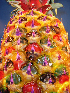
I rather think i shot myself in the foot with last weeks pineapple. How can you top a pineapple with all it's inkable textures and sheer mammoth size? I decided not to dwell on it to much and found myself a fruit that is not only delicious, but was a pleasure to ink.

So without further ado, i give you......the GALA MELON!!!!!!


Yes ok i know it looks like i've just blobbed ink all over it, but oh how wrong you would be!

I began by doing some blending with distress pads and applicator tool/foam pad. This went well, however the yellow background colour of the melon hid the colours a bit. The i accidentaly spilt some red on the melon, so i decided to change my design to somewhat of a "globe" effect.

Just tell me that doesn't have some kind of "fruity world" thing going on there!!!?
Now then, once again i hear the crowds shouting for me to stop waffling and give the scores on the doors, soooooooo.........
On my Fruitinkability scale of one to ten, i think i'm going to give this a comfy 5!!!
The texture was great to ink, in the close-up below you'll see the kind of terrain i had to master in order to ink this baby!!! The ink bled nicely into the different patterns on the melon skin and all in all, it held onto the colour well.

Now then, the melon above was very yellow, very ripe as i found out later when i dropped it....and a little too moist to ink, hence the reason i had to use more neat ink than blended.
So today i got an un-ripe gala melon and it was much better to ink.
I just had a play with distress pads only, but it was still fun. After colouring it nicely, for some stupid reason i tried to put some black bands around it, for the first time in history, a melon went pearshaped!
Not a great result, but if you should ever feel like inking a melon, get the un-ripe ones, they are much drier and nicer to ink. (Even if this one looks a mess!).
Kind of looks like a funky bowling ball does'nt it? :)


Why only a five then? I think there are lot of fruits out there that can top it, i've yet to find them, but i know they are out there!
I have had some excellent suggestions so far. White grapes, a star fruit...which WILL be mine next time i find one!.....and more recently i had the request of a pumpkin!!! To be honest though, it would be rude not to leave the pumpkin for a special Halloween fruit ink.
Calv's safety tip: I have to chip in here with a reminder NOT to eat any fruit that has been inked. I am NOT Willy Wonka.....i may be as bizzare as Mr Wonka at times, but alas i merely brighten up fruit and my methods will not make it tastier!!! :)

Anyway folks, i'm tired, you were probably asleep a few minutes ago, so i'll shut up and say goodbye. Cheers for tuning in, same time next week, until then......stay fruity!!! :)

A nice suprise...Tim Holtz said hi!!!

Just before 3am this morning, i was pottering around my blog when i saw i had a comment on my "star themed pocket challenge" post. So i clicked on it to see who it was, and it was none other than Tim Holtz!!!

What a star for doing that! Since getting into crafting, i have become increasingly drawn to his work. Not just the work he produces, but the way he delivers it too. He is easy to follow, enjoyable to watch, and you can tell he's just a nice guy. Can't ask for much more than that in a role model can you?

I've followed his blog for a while now, and what made it all the more nice that he posted here, was that you can see by his blog what a workload this guy has! I'm surprised he has time to even get on the computer!

So yeah, a lovely surprise on this rainy typical Monday morning in England. I know many of you will have already met him, and hopefully i will too one day if he's over the UK again.

Thanks Tim! :)

Star themed pocket challenge.

Over at Ink On My Fingers, Hels has set a challenge to make a pocket from the template she has provided, with a "star" theme to it.

The pockets are that great, so much in fact, they even had thier very own double page spread in the October edition of "Craft Stamper" magazine! Well done Hels! :)

So i thought I'd give the challenge a go......heres my effort.


For me, this pocket reminded me of my two daughters.....no it's not full of attitude......:)

I used part of my nice Once Upon A Time papers for the front and a nice fancy brad as a closure, this reminds me of the girls more "princessy side", the fantasy world they often play in and the likes.


Inside shows me thier girly Hollywood dreamy side, all pink, stars and glitter!

I really enjoyed this challenge, i think I'm right in saying it's my first from someones blog, so thanks for that Hels.

Whilst making this, it also gave me an idea for another style pocket with slightly different dimensions, my girls will love that as a "secrets" pocket.

Thanks again Hels. :)

By the way, if you are wondering what the silver mess is in the top right corner of the pocket, it was my failed effort at embossing! That's not half as bad as the silver mess on my new carpet where i just dropped an entire tub of fine glitter on it!!!

Wednesday 10 September 2008

Crackle glazing tip.

This is probably old news to most out there that have dabbled with crackle glaze, however i did not know about this tip until i tried it myself, so I'm passing it on to anyone else who is new to crackle glazing.

In the past when i have used crackle glaze to give that lovely vintage crackled effect, i have just squeezed it on as level as possible on my stamp board, and just hoped for the best as far as it evening itself out. This has led to thicker parts of crackle glaze in some areas of the stamp board, and thin in others. This can also result in you using more than needed.

So last night i tried painting the glaze on, which gave it a thin, even layer, which when dry will leave a thin, even crackled texture which will not hinder the view of the picture underneath.

Here is a quick look at it step by step, very basic i know, but it may help.

*Click on images to enlarge*

1. First i used distress ink pad colours and did a two colour blend on a piece of white stamp board. Once dried, i then chose an image and stamped it onto the board with black archival ink. (You do not have to use archival ink for this).


2. Next i squeezed the crackle glaze around the stamp board in random lines. You could just do a blob, it doesn't really matter.

3. I then took a paintbrush, this one is a 1/2in soft bristle ordinary cheap paintbrush......


.....and painted the glaze on the board as you would if you were painting normally. the glaze should now be evenly spread across the board.


4. Allow the crackle glaze to dry. Follow the drying times on the instructions as this can vary from product to product. You should be left with a nice even crackled effect on your piece, ready to use as you wish. Normal rule of thumb is that the larger the cracks you want, the thicker you apply the glaze.
5. Lastly, i rubbed over the whole piece with a distress pad, the ink colours the cracks nicely.


Like i said, this is probably a basic tip that most already use out there, but i didn't know it so i can't be the only one! :)

Ah......as usual the woman is right......my girlfriend Maddy has just said that you have to be carefull that you do not force air bubbles into the glaze when using a brush to apply it. Plus if it is too thinly coated, it can cause bits to come off later down the line. Cheers for the tip Maddy.
Maddy has a nice crackle glazed piece on her distressed album card on her blog here.
So as long as you bear this in mind, hopefully this will come in handy.
Edited to say: Looking back on this, i'm not 100% happy with the result, maybe thats due to the colour, maybe i did it too thin? Definately needs more crackle to it! Have i then wasted the best part of an hour trying it? Nah.....i'll file this one under "learn from experience". :)

More blending practice tonight.

As a wise man once said, "You become a master of what you focus on".

Well although i have a long way to go until i get to that stage, i am REALLY enjoying this blending lark! Tonight i had another go, just to iron out a few difficulties i had the other night really, and it is getting better. Still the usual suspects of the two rogue big sploshes, but I've worked out a solution for that.......


I played with the same colours as i used the other night. First i stamped in black StaZon. Here i used a gorgeous stamp which has a quote from Alice in Wonderland. I bought it from a lovely lady called Nikki who owns DewDrop Craftz , and it is definitely one that will be used a lot!

Colours of distress pad used were, Broken China blue at the top, Fired Brick red at the bottom, and Shabby Shutters green at the right side there. After i had blended them together from the outside inwards, i gave it a dusting of Dusty Concord purple for the edges. This really gives the colours a lovely mystical feel to them.

Then came the water flicking!!! The mistake i made last time was to hold my hand with tons of water on it, over the tag, and i ended up with big blobs when i wanted small flicks. This time i tried it with a toothbrush. I ran the brush under the cold tap, lightly tapped the brush against the sink to get rid of the big bits of water, then flicked the brush at it. Apart from the two big blobs on the left hand side, which occurred because i forgot to tap the brush the rest of the blobs are just how i wanted them.

So from now on it's wet, tap and flick! :)

Apologies for rambling on about this again, but it's more a reminder to myself so i can get the technique down to a fine art.

Night all. :)

Tuesday 9 September 2008

Handy mobile paper storage idea.

At present i do not have anything to carry 12 x 12 papers in. If i go to a shop it was always a bit of a pain putting the papers into a plastic bag, especially if they were bought singularly. They could end up bent or damaged by rain due to our lovely weather here in England.

For a temporary measure though, my girlfriend Maddy gave me a spare laptop carry case that she had lying around. She suggested sticking a couple of bit's of mount board in it, and sandwiching the 12 x 12's between them. It works perfectly! Cheers Maddy x.


I use a backpack a lot, and i would dearly love to see a craft tote bag designed in backpack form. Something big enough to carry 12 x 12, but have all the storage compartments to house your crafty stash. This would also allow you to carry it hands free so you can carry the rest of the mountain of goodies.

I know there are tote bags already on the market, but to be honest none of them appeal to me. I would like something a little more manly than pink or lilac please, and if brown has to be the only colour tote bag designers can come up with, could they please make it just a tiny bit funky?

Before anyone mentions the camofladge options, i spent enough years wearing the stuff to stop my backside getting shot off in the forces, so i'd rather not go down that avenue of fashion thanks. :) (Yes i know, i'm too fussy). Don't get me wrong, i can be the biggest girl at times when it comes to colours and crafty items, but just once i'd love to see something that a guy would'nt be embarrassed going to a craft workshop with!

Something like this.....


...but with crafty storage and wide enough for 12 x 12's.

Another handy storage container i use a lot, is the plastic cases from the Ferrero Rocher chocolates. It's the box with 16 chocolates inside, unfortunately though.....and i know this will really put a dampener on the idea....you have to eat the choccies first!!! :))))))


Being perfectly clear, they are great for storing bits in. I use them for tools, embellishments, i love the fact you can see everything inside them. Last night i discovered that they are a great fit for the Tim Holtz Distress Ink pads. Arrange them how you want, they can fit eight pads into each box.


I'm hopefully going to build some custom fit wooden storage for these this week, so I'll post some pics when it is done.

"Quotes" tag book.

I have not been feeling too great today for one reason or another, and for a while i thought i'd totaly lost my crafty mojo!

So i decided to look through a book that Maddy gave me called "The Organised Scrapbooker" for inspiration. It's a great book with info on everything to do with storage, scrap room planning, getting yourself out of a crafty rut.....all the important things that normal people don't worry about!

One thing that caught my attraction was a tag book in which you keep your favourite quotes. I love quotes, i have books on them and think it's great that just a few words can change so much if you let them. Heres the front cover......


So i had my first go at blending, using some lovely distress pads that arrived for me today, and i had a play with some of my new stamps. I tried to loosely follow the tutorial that Dan over at A Crafty Life did recently, but as usual, my effort soon went pearshaped!

The blending could be better, but it was my first time so i am still pleased with it. I flicked too much water at the tag too, so there are a few splodges instead of dots on the ink, but hey, i've learnt for next time. What i did wrong was instead of just flicking water at the tag, i also held my hand over the tag and let the water drop onto it, causing big drops to hit and rest on it. Not as subtle. Maddy suggested flicking it with a toothbrush for finer spots.

The flower stamp in the middle was coloured with chalks.


The oval label with the word "Quotes" inside, is actualy a stamp with a different word in it. I just inked the stamp with StaZon, covered the word inside the oval border with a piece of paper to mask the wording, then stamped it onto my tag. This left a stamped oval label, blank inside, in which i could them write the word "Quotes".


I love this saying by Anthony Robbins. It means that your life or what you do in your life, resembles those who you are in the company of most. I like to apply this saying to my crafts. I have always had a great teacher in Maddy when it comes to learning techniques, and if i surround myself with people, blogs and inspiration of a high crafty calibre.....my work can only get better!

Sunday 7 September 2008

Whilst we are on the subject of ink pens, i have just had my new bottle of black ink arrive today, a lovely surprise considering it's Sunday! There only seems to be a few companies that sell it here in the UK, i got this one from a great site called "The Writing Desk".


It's Noodler's "bulletproof" black ink. "Bulletproof", as the company says on it's website is......

"An ink designated by Noodler's as "bulletproof" means it stands up against bleach, UV Light, industrial chemicals, etc., making it impossible to forge a check! The cellulose reactive dyes are completely water soluble in your pens and in the bottle, but once the ink dries on the paper, it is totally waterproof and permanent!"

This stuff is the business! No longer will i have to worry about so called "permanent" inks smudging in the post on envelopes. The water tests that have been carried out on this ink have proved it is a great one for using in letters or artwork that you want kept for years. It will revert to normal ink without the "bulletproof" qualities if it is mixed with any other ink, but you just don't do that.

With my track record, i am going to have to be carefull with it, spillages just cannot happen with this one!

Saturday 6 September 2008

Got a new pen today.

Well it's very quiet here today in the land of Calv. I've had a shifty around of my furniture as i needed a more organized house to settle back into after trashing my craft room making a single project!

On the plus side, i had a new fountain pen arrive today! Yes i know that might sound a little geeky to many, but i have to admit to having a bit of a fountain pen fetish. I've always had it, so every now and again i have to feed my need for inky instruments and get a new one.

It was only cheap, but i liked the look of it and it writes so nice....


I have loads more scattered around the house, some of which I'm sure my girls have pinched for school. The above are the ones i use daily.

I am teaching my girls how to use a calligrapghy pen at the moment. I learnt at an early age at school, and it helped my handwriting a great deal. I think schools school bring back penmanship in the school curriculum, but unfortunately i fear those days are fast disappearing amidst the mass of computers in the schools now.

Don't get me wrong, computers are great, but when they break, what does everyone do? Reach for a pen.

Lets just hope our kids children know how to use one in years to come!

Theres nothing better than getting a handwritten letter amongst the bills on your doormat. Once you find the perfect fountain pen for you, it's hard going back. It does not have to be expensive either, i have pens ranging from a couple of pounds to £300......and the best pen i ever wrote with was a fountain pen from Tesco's supermarket here in the UK worth .78p!!!

Theres no reason why you can't employ some of the skills employed in crafting too, artistic envelopes or "mail art" as it's often called, are beautiful to receive and to just look at.

I'm hoping to have a bash at this in the near future with the rather large assignment of writing themed rubber stamps i have in the post. I have some arriving from the US, and i just received a great stamp collage sheet from Jennie at The Artistic Stamper, and i have more on the way too! Cheers Jennie! :)

I go to bed a happy boy tonight! :)

What i've learnt today.....

I've been after something to wear whilst crafting as i seem to wreck everything i craft in!

After the thousandth time accidentally splattering alcohol ink on my clothes, i decided to make a crafty t-shirt, something i am not fussed about getting messy.

So after investigating a few methods of applying different colours to fabric, i have learnt the following things.....

1. Always listen to your fellow crafters!!! If they say that alcohol ink is not great on fabric, don't think it "may be different for your t-shirt!

2. Permanent calligraphy markers, whilst good on other materials......look rubbish on fabric! They bleed, don't write smooth and basically make a hash up of your already hashed up t-shirt project!!!

3. StaZon does not come out nice when stamped on fabric. I guess the material soaks it up and you can hardly see the result!

4. Distress pads do not make your t-shirt look vintage.....it looks like you need a bath!

5. Finally, no matter how many of Tim Holtz's videos you have watched, no matter how easy Tim and other crafters make the blending technique look.......it will not work on a t-shirt!!!!!! Well not mine anyway!

So i now have a t-shirt that looks like it's subjected to a frenzied ink attack, by a colourblind two year old!!!


How not to do it!


On a positive note, i now have a t-shirt that really can't get any worse through crafty spillages!!!
Back to the drawing board methinks. Time to go and learn how to make decent t-shirts!

Thursday 4 September 2008

Made a card tonight!

More of a colourfull play about really, but over at the Crafts By Carolyn forum, one of the many competitions that are running is one to make a card with just stamps and inks. No patterned paper.

So i dug my Tilda stamp out, she's been a bit neglected lately, my chalks and Whisper pens, and a lovely Lavina willow branch stamp.

Click the image for a better view.

Yes my fruity friends.....

It's that time of the week already, oh yes indeedy it's Thursday and we all know what that means......it's time for "Fruit i inked today!".

It's the one day in your busy schedules where you allow yourself to dive into the world of the juicy.

After last weeks inked grape, i felt i needed to produce something with a little more excitement about it. I had a great suggestion of a star fruit, however trying to find one of those in my local supermarket was maybe a little ambitious!

So in the end, i threw the fruity rule book out of the window......and without further ado......good people of the craft world.....may i present to you the monster that is the pineapple!!!!!!!!!


Well what can i say!!! An inky challenge was what i asked for, and thats exactly what i got!

I had to put a little time and effort into this one, not just a dab and hope for the best. That would have potentialy been a huge mess with me doing it! Well this beauty was an absoloute pleasure to ink. There were several different textures to work on, the main body segments were nice and shiny, so the ink flowed lovely over them, and the leaves just soaked the ink as soon as i touched them.

You've probably guessed that i did not use an ink applicator for this one, in fact i used a fine paint brush to apply the inks. I was going to add mixative and blending solution, but the result was so good without it, i thought it was a shame to go any further.

I also had a bash at stamping the leaves, but it didn't turn out too good. The segments that appear gren are actualy inked with Adorindack "Pitch black", it just turned out that colour against the yellow of the pineapple. Other colours used were Wild plum, Red chilli pepper, Stream blue and lettuce. A mighty fine coctail!

Now then, "Whats the scores on the doors for fruitinkability dagnammit!!!?" i hear you cry?
Well i had some much fun inking this, and was so pleased with the result, i'm going to have to give it a
fruitinkability rating of 7!!! It's going to take some beating to top this one, but i could'nt score it any higher as there HAS to be the perfect fruit out there for inking?

I will make it my mission to find that fruit, and when i do,....oh yes my friends......ink will fly in my craft room that fine day!!! It's just gone 5am and i need some beauty sleep. Thanks for tuning in, same time next week.......keep that Thursday free people!!! :)

I'll leave you with one more pic...looking up the belly of the beast!!!


Reminder: Do not attempt to eat anything covered with alcohol ink, whilst most people aren't that stupid, theres always someone who likes to be an exception to the rule!

Don't ask me what it is!

Not sure what it was intended to be, but i saw these words on a poster today and thought they would look good on a sign. So i started this tonight, bit tired so will do more later.


Wednesday 3 September 2008

A couple of tools i made.

I put this on the Crafts By Carolyn forum a while back, a very quick and easy way of making yourself a chalking tool for under 50p, and you can decorate it anyway you want.


Tutorial......get ready for this......it's a tricky one!

1. Get a crocodile clip from any hardware or electric shop.

2. Get some dowelling, this was about 4 or 5mm width dowelling. How long you have it is up to you, i do mine about pencil length.

3. Put some decent glue on one end of the dowelling
and slide it into the gap in the crocodile clip. I used Araldite Epoxy Rapid, sets real fast and lasts forever!

4. Decorate as you wish. I did simple petals on this one, my girls did a couple with dots all over them like aboriginal art. I put a coat of quick drying varnish over the top to save your paintwork. I used Fimo varnish on this one.

Thats it, one chalking tool.

I've got a couple of these that are double ended, (clip at either end) so if you want to have two chalking balls on the go at once without swapping over all the time, you can.

(Calv's safety tip: If using any kind of epoxy resin glue, please go carefull with it. If you want stories about accidents and glue......just grab a coffee and pull up a chair coz i'm your man!!! Epoxy is extremely hard to get off skin when you accidentally step on a blob and glue your bare foot to the kitchen floor too.....apparently!)

Small amounts of glue on your skin are usually manageable, but if like i did one day you accidentaly burst an ENTIRE tube of superglue in your hands.......and stick your hands together and the tube to your hands too.........(don't ask!).........do not try pulling your hands apart without soaking them in some kind of thinner first. It's real painfull. I got mine off by soaking my hands in a bowl of nail varnish remover with acetone in for 20 minutes.

If i remember rightly though, i was in my dressing gown, hands stuck firmly together, and my girlfriend went for her camera before the first aid box though!

How very considerate! :)


Next....an easel. It doesn't matter if you buy or make this as i did, a small easel in your craft room can be used to display finished work or a work in progress.


I won't do a tutorial for this one, as i found out places like Ikea do them for about 50p (bet mine lasts longer though!), but heres my handmade one in action.

They can fit 12 x 12's on them.......


....or as a cheap book stand whilst working from a book.....


Screw and glue, thats all i did with this.